The CSS Box Model
What is the CSS Box Model?
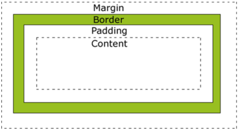
The CSS Box Model is a model which depicts each HTML element to be surrounded by a box with multiple layers:
Types of box
As prior mentioned, the box model depicts each element as being surrounded by a box - there are two main types of box that this could be:
- Block box
- Inline box
Both block and inline boxes have inner and outer display types that dictate how elements should behave.
Inner and outer display types
The outer display type in CSS is used to detail whether a box is inline or block. Block elements behave as follows:
- They break onto new lines
- They extend horizontally (width wise) to fill the available space in its container
- width and height properties are respected
- padding, margin and border cause other elements to be pushed away from the box
Inline elements behave as follows:
- They do not break onto new lines
- width and height properties are ignored
- Vertical padding, margins and borders apply but do not cause other inline boxes to move away
- Horizontal padding, margins and borders apply and do cause other inline boxes to move away
Elements such as p, h1-h6, div, etc... use block as their default outer display type whereas elements such as span, a, em, strong, mark, etc... are inline by default.
To change the outer display type of an element, use the display property:
<h1 style="display: inline;">This title</h1>
<p style="display: inline;"> - is on the same line as the paragraph</p>
This renders as follows:
This title
- is on the same line as the paragraph
Inner display types dictate how elements nested inside of an element behave; by default, elements are laid out according to normal flow, meaning they behave like any other block or inline element.
The inner display type can also be changed using the display property. For example, two new layout models were added by CSS3 - Grid and Flexbox - setting the display property to grid or flex will change the inner display type to grid or flex respectively whilst the outer display type will be block.
The parts of the box
This graphic, displayed at the beginning of this section, demonstrates the box that forms around an element and the different layers making up that box:
- Content box: The content that is displayed in the browser, sizeable using the width and height properties
- Padding box: The padding wraps around the content box as whitespace, its size can be controlled with the padding property
- Border box: The border wraps around the content and any padding (there might not be any padding), control the size and style with the border property
- Margin box: The margin wraps around the content, padding and border as whitespace between this box and other boxes in the document. Control the size using the margin property
The standard CSS box model follows the above rules. In the next example, this model is demonstrated:
<div style="display: inline-block;
                width: 200px;
                height: 200px;
                margin: 8px;
                padding: 16px;
                border: 5px solid black;
                background-color: blue;"></div>
<div style="display: inline-block; width: 200px; height: 200px; margin: 8px; padding: 16px; border: 5px solid black; background-color: red;"></div>
This example demonstrates usage of another display type, inline-block which makes elements behave like an inline element but the width and height properties are obeyed. The example renders two boxes, one red and one blue with a black border:
The div element is a non-semantic element often used for styling purposes, be careful not to overuse this element as it may easily reduce accessibility due to its non-semantic nature - screen readers are unable to identify what exactly a div is and thus usually ignore them.
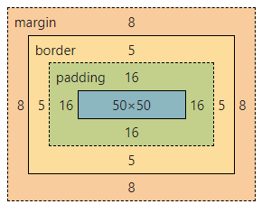
According to the standard CSS Box Model, the actual space taken up by an element can be calculated by doing the following:
- Total width = width + padding-left + padding-right + border-left + border-right
- Total height = height + padding-bottom + padding-top + border-bottom + border-top
The margin is ignored and does not count towards the size of the box as it only affects space outside the box, the boxes area stops at the border and does not extend into the margin.
If we set the margin to 0px, there will be no space between the two boxes:
Or so we would expect... Unfortunately, the inline-block outer display type is still inline - this means our elements are having spaces inserted between them as if they was text. There are a few tricks to solve this issue, the easiest is to use another display type like flex. The following example fixes this by using a negative 4px right margin:
<div style="display: inline-block;
            width: 50px;
            height: 50px;
            margin: 0px;
            margin-right: -4px;
            padding: 16px;
            border: 5px solid black;
            background-color: blue;"></div>
<div style="display: inline-block; width: 50px; height: 50px; margin: 0px; margin-right: -4px; padding: 16px; border: 5px solid black; background-color: red;"></div>
The flex display type could also have been used, example markup and styling looks as follows:
HTML<div style="display: flex;">
    <div style="width: 50px; height: 50px; margin: 0px; padding: 16px; border: 5px solid black; background-color: blue;"></div>
    <div style="width: 50px; height: 50px; margin: 0px; padding: 16px; border: 5px solid black; background-color: red;"></div>
</div>
The alternate box model
The alternative CSS box model is known as the border box CSS model, where the specified width is the actual total width of a box on the page. This means the contents width is either the size of the specified width or smaller, it doesn't expand the box when padding or borders are applied.
- Content area width = width - border-left - border-right - padding-left - padding-right
- Content area height = height - border-bottom - border-top - padding-bottom - padding-top
To activate the alternate box model, apply the following CSS rule to an element:
CSS.box {
    box-sizing: border-box;
}
To set all elements to use the alternate box model, a common reset used by developers, apply the following CSS rule to the HTML element and allow it to be inherited by all elements:
CSShtml {
    box-sizing: border-box;
}

*, *::before, *::after {
    box-sizing: inherit;
}
Using inheritance to inherit the selector style allows it to be more easily overridden, useful if you ever want to apply thecontent-boxmodel to any elements again. This page is doing exactly that, a reset has been applied in the stylesheet to make every element inherit theborder-boxmodel, and where examples need to be rendered using thecontent-boxmodel, that sizing property has been applied.
Applying the box-model to the previous example, the blue and red square, actually shrinks the boxes as they now honor the specified width:
Margin, padding and borders
The margin, padding and border properties demonstrated above are shorthand properties that allow us to quickly set sizes and other values - the following sections explore the longhand equivalents and how these can be represented shorthand.
Margins
Margins are the space around a box which pushes other elements away, these margins can be positive or negative. The margin of an element is always added after the visible boxes size has been calculated, whether using the standard or alternate box model.
Negative margins may causes boxes to overlap other elements on the page.
There are four margin- properties used for controlling specific sides:
margin-leftmargin-rightmargin-topmargin-bottom
The margin property is a short-hand for those four properties. For example, the following four CSS rules are all equivalent to each other:
.margin-test1 {
    margin: 8px;
}

.margin-test2 {
    /* margin: top right bottom left; */
    margin: 8px 8px 8px 8px;
}

.margin-test3 {
    margin-left: 8px;
    margin-right: 8px;
    margin-top: 8px;
    margin-bottom: 8px;
}

.margin-test4 {
    /* margin: vertical horizontal; */
    margin: 8px 8px;
}
Collapsed margins
Margin collapsing occurs when two elements margins touch, the margins quite literally collapse into one margin in all but a few exceptions. Collapses occur under the following conditions:
- If two elements touch whose margins are both positive, those margins combine to become one with its size equal to that of the largest margin of the two elements
- If two elements touch where one margin is negative, the negative margins value is subtracted from the total margin.
- Where both elements margins are negative, the margins collapse and the smallest value is used (-3 is smaller than -1)
The following example uses the two boxes from earlier, but leaves them in normal flow (the div's default to block) to demonstrate margin collapsing. Both div elements have been styled exactly the same, barring colour, with an 8 pixel margin:
<style>
    .box {
        width: 50px;
        height: 50px;
        margin: 8px;
        padding: 16px;
        border: 5px solid black;
    }
</style>

<div class="box" style="background-color: blue;"></div>
<div class="box" style="background-color: red;"></div>
The rendered example would look as follows:
If we look in-depth using Chrome Dev Tools, we see that the box is 92 x 92 pixels (not including margin):
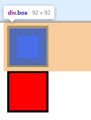
- The boxes total width is
50px (width) + 16px (padding-left) + 16px (padding-right) + 5px (border-left) + 5px (border-right). The height is similar, but uses top and bottom padding and border instead for the calculations.
This also demonstrates an instance of margin collapsing, the bottom margin of the top square and top margin of the bottom square have collapsed to become one 8 pixel margin instead of 16 pixels:
If we set the top margin of the red square to be -4, the overall margin will become 4 pixels and the squares will become slightly closer due to the effect of margin collapsing:
Padding
Padding is between the border and the content area and must take a value of 0 or greater, negative values are not allowed unlike margins.
Background images or colours applied to an element will still be visible in the padded area
There are four properties for managing the padding of individual sides of an element:
padding-leftpadding-toppadding-rightpadding-bottom
The shorthand padding property can also be used as follows:
selector {
    padding: top right bottom left;
    /* or */
    padding: vertical horizontal;
    /* or */
    padding: all_sides;
}
The following two examples are equivalent to each other:
.pad-med {
    padding-top: 0px;
    padding-bottom: 0px;
    padding-left: 8px;
    padding-right: 8px;
}

.pad-med-alt {
    padding: 0px 8px;
}
Borders
The border is between the margin and padding, when using the standard CSS box model the size of the border is added to the width and height. The alternative CSS box model makes the content box smaller as the border is part of the width and height.
The following four properties are used to style individual sides:
border-leftborder-rightborder-topborder-bottom
The following properties can be used to set the width, style and colour of a border (all sides):
border-widthborder-styleborder-color
The border property is a shorthand property for border-width, border-style, and border-color:
selector {
    border: line-width line-style color;
}- The width will default to
mediumif absent - The style defaults to
noneif absent - The color defaults to
currentcolorif absent
The following example CSS and HTML demonstrates different ways of using these properties:
<style>
    .box {
        width: 50px;
        height: 50px;
        margin: 8px;
        padding: 16px;
        border: 5px solid black;
    }

    .box-alt {
        width: 50px;
        height: 50px;
        margin: 8px;
        padding: 16px;
        border-width: 5px;
        border-style: solid;
        border-color: black;
        border-left: 8px dashed white;
        border-right: 8px dashed white;
    }
</style>

<div class="box" style="background-color: blue;"></div>
<div class="box-alt" style="background-color: red;"></div>
This will result in two boxes with two different borders, a solid border and a jigsaw piece like border:
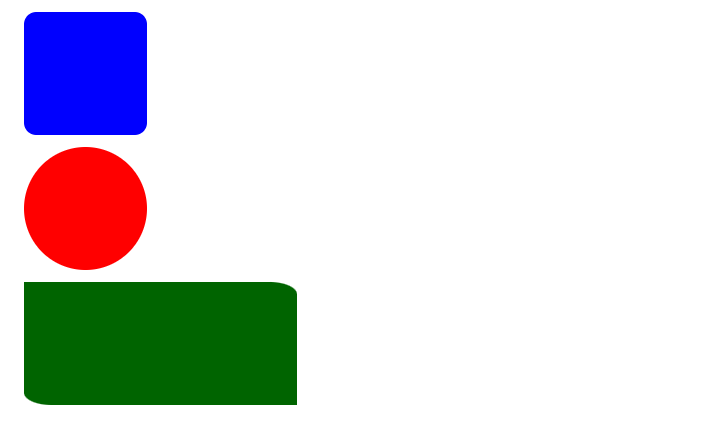
Borders can also be rounded using the border-radius property:
border-radius: all_sides;border-radius: top-left/bottom-right top-right/bottom-left;border-radius: top-left top-right bottom-right bottom-left;
The radius will be applied to the element even if no border was specified, here is some example CSS and HTML:
<style>
.fill {
    width: 50px;
    height: 50px;
    margin: 8px;
    padding: 16px;
}

.rounded-box {
    background-color: blue;
    border-radius: 10% 10%;
}

.cool-box {
    width: 150px;
    border-radius: 0 10% 0 10%;
    background-color: darkgreen;
}

.circle {
    background-color: red;
    border-radius: 50%;
}
</style>

<div class="rounded-box fill"></div>
<div class="circle fill"></div>
<div class="cool-box fill"></div>
This will render the following shapes: