Styling lists
Lists are commonly used in web development, and not just as you might expect. A common practice is to actually turn lists into navigation bars. This sections will explore different ways of styling lists using CSS:
Styling lists with CSS
When creating lists, the first thing to do is to reset the spacing to ensure they keep the same vertical and horizontal spacing as their surrounding elements (paragraphs, images, etc...). The following example demonstrates a simple CSS reset for this with a styled list:
<style>
*, *::before, *::after {
    box-sizing: border-box;
    padding: 0;
    margin: 0;
}

html {
    font-size: 10px;
}

body {
    padding: 0 16%;
}

ul, ol, dl, p {
    font-size: 1.5rem;
}

li, p {
    line-height: 1.5;
}

dd, dt {
    line-height: 1.5;
}

dt {
    font-weight: bold;
}
</style>

<ul>
    <li>Apple</li>
    <li>Orange</li>
    <li>Pear</li>
</ul>
The first rule resets all elements to use the alternative box model and sets their margin and padding to 0. The html rule sets the font size to 10 pixels, this is to make working with relative units such as rem easier.
rem values range from +/-1.0. A rem value of 1 means text will take on the same font size as specified in the root element, the html rule. 1.5 means the text will be 50% larger, 0.5 being 50% smaller.
The rules affecting lists, paragraphs and list items set the line-height to ensure consistent spacing between elements.
List properties
CSS list properties can be used to change the style type, the position of the style (the bulletpoints) and whether a custom image is used or not.
list-style-type
The list-style-type property is used to change the marker in use for a list, possible values include:
selector {
list-style-type: disc | circle | square | decimal | georgian | upper-roman | lower-roman | lower-latin | upper-latin | etc... | none;
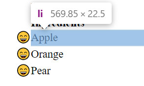
}A Unicode value can also be specified as a list marker, for example the Unicode U+1F604 is a smily face emoji (list-style-type: "\1F604";):
- Apple
- Orange
- Pear
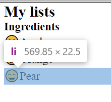
list-style-position
This property is used to change the position of a list marker to inside or outside the list:
list-style-position: outside | inside;By default, list markers appear outside of the list item itself:
If the markers are changed to be inside instead, the markers will be inside the list:
Navigation bars with lists
As prior mentioned, it is common to create navigation bars using lists. The following two examples demonstrate creating a desktop top navigation bar and side navigation bar.
Top navigation bar
To make a simple, left-aligned navigation bar using a list. We first create the structure in HTML:
<nav>
    <ul class="navbar">
        <li class="nav-btn"><a class="nav-link" href="#">Home</a></li>
        <li class="nav-btn"><a class="nav-link" href="#">Store</a></li>
        <li class="nav-btn"><a class="nav-link" href="#">About</a></li>
        <li class="nav-btn"><a class="nav-link" href="#">Contact</a></li>
    </ul>
</nav>
We first created a nav element as a container, this is for semantic purposes to aid accessibility. A nested unordered list is then declared with a class navbar applied to it. The ul contains multiple nested li elements with the class nav-btn, each one with a nested anchor with the class nav-link. Without any CSS, it will just be a normal list of block level elements. Adding CSS to set the list marker to none and then setting the li elements to inline-block will allow for a row of elements to be created:
.navbar {
    width: 100%;
    list-style-type: none;
    border-bottom: 1px solid gray;
    font-size: 0;
    padding: 0;
    margin: 0;
}

.nav-btn {
    display: inline-block;
}

.nav-link {
    display: inline-block;
    padding: 8px 16px;
    text-decoration: none;
    color: white;
    background-color: black;
    font-size: 1.5rem;
}

.nav-link:hover {
    background-color: limegreen;
}
This will produce the following navigation bar:
- The
hrefattribute is not specified on the navbar rendered above, it would be in actual implementation.
Vertical side navigation bar
Often, side navigation bars are used for documentation sites. The following example demonstrates a side navigation bar:
<!DOCTYPE html>
<html>
<head>
    <meta name="viewport" content="width=device-width, initial-scale=1.0" />
</head>
    <style>
    *, *::before, *::after {
        box-sizing: border-box;
        padding: 0;
        margin: 0;
    }

    html {
        font-size: 10px;
    }

    ul, ol, dl, p {
        font-size: 1.5rem;
    }

    li, p {
        line-height: 1.5;
    }

    dd, dt {
        line-height: 1.5;
    }

    dt {
        font-weight: bold;
    }

    .navbar {
        display: inline-block;
        width: 20%;
        height: 100vh;
        max-height: 100vh;
        overflow-y: auto;
        background-color: gray;
    }

    .navbar > ul {
        list-style-type: none;
        border-bottom: 1px solid gray;
        font-size: 0;
    }

    .nav-link {
        display: block;
        width: 100%;
        padding: 8px 16px;
        text-decoration: none;
        color: white;
        background-color: black;
        font-size: 1.5rem;
    }

    .nav-link:hover, .nav-link.active {
        background-color: limegreen;
    }
</style>
<body>
<nav class="navbar">
    <ul>
    <li><a class="nav-link active" href="#">Home</a></li>
    <li><a class="nav-link" href="#">Store</a></li>
    <li><a class="nav-link" href="#">About</a></li>
    <li><a class="nav-link" href="#">Contact</a></li>
    </ul>
</nav>
</body>
</html>
The above example renders the following:
Add the following CSS to include content to the right of the navigation menu using an element with the idmain-content as a container:
#main-content {
    display: inline-block;
    max-width: 80%;
    height: 100%;
    font-size: 0;
    vertical-align: top; /* align elements from top */
}
This would look as follows when applied:
A page title
Lorem ipsum dolor sit amet consectetur, adipisicing elit. Deleniti adipisci quasi odio dolores aliquid repellendus inventore dicta similique, facilis neque quo voluptatem maiores vitae cumque! Impedit architecto reiciendis eius expedita?
Lorem ipsum dolor sit amet consectetur adipisicing elit. Nisi facere impedit voluptates. Repudiandae, quasi neque impedit odio ullam eveniet quod expedita distinctio molestias iusto, illo nulla, nobis veniam qui suscipit.
A consequuntur aliquid similique. Excepturi nostrum veniam minus, recusandae inventore quidem tempora quod itaque labore esse aspernatur dignissimos, sequi pariatur id aliquid doloremque alias ipsam sit quo in. Amet, in.
Repellendus voluptate debitis ipsum fuga quo. Sed, quibusdam. Neque aliquid, natus expedita consequuntur accusamus facilis, a reprehenderit blanditiis eveniet corrupti voluptas accusantium unde. Saepe fugit optio, suscipit voluptatibus vel molestias!
Error quas praesentium modi veritatis harum fugiat, similique dolor eos, velit mollitia unde quo cumque, autem ex tenetur explicabo voluptate soluta. Sunt iusto, veritatis facilis exercitationem vel nam id dicta!
A simple responsive navigation bar
In this example, a mobile-first responsive navigation bar is created using Flexbox from CSS3. Flexbox is a display type for creating one-dimensional content, a navigation bar is one-dimensional; horizontal on large screens and vertical on smaller screens like mobile phones or tablets.
The HTML for the navigation bar is the same as the previous example, the difference is in the CSS that is applied. Before looking at the CSS though, try resizing the screen to see what happens with the navigation bar below:
This navigation bar becomes a vertical bar when the screen-size is below 1024 pixels, the average screen size for a small laptop. The CSS is as follows:
.navbar {
    display: flex;
    flex-wrap: wrap;
    list-style-type: none;
    padding: 0;
    margin: 0;
}

.navbar > li {
    width: 100%;
    text-align: center;
}

.nav-link {
    display: block;
    width: 100%;
    padding: 8px 16px;
    text-decoration: none;
    color: white;
    background-color: black;
    font-size: 1.5rem;
}

.nav-link:hover,
.nav-link.active {
    background-color: limegreen;
    cursor: pointer;
}

@media screen and (min-width: 1024px) {
    .navbar {
        align-items: flex-start;
        flex-wrap: nowrap;
    }

    .navbar > li {
        width: auto;
    }
}- First, the display type of
flexis applied to the navigation bar using the class callednavbar. This affects the immediate children of the element it is applied to, making them all line up in a row by default. - The
flex-wrapproperty is set towrap, this means the child elements (theli's) will wrap onto a new line should their width expand whatever element is containing them. - The
lielements are given a width of100%so each link takes up a whole line, this is the mobile-first aspect of the design. - A media query,
@mediais used to apply styles when a certain condition is met, in this case that the screen has a minimum width of 1024 pixels. - When the media query is activated, the navigation bar has its
flex-wrapproperty set tonowrap. This prevents the list items from wrapping onto a newline on larger displays. The width of eachliis set toautoso that its width is that of the list items content rather than100%of its container.